
Welcome!
This is where I share my thoughts through education, poetry and sentiment.
The Kathryn Bevier Artworks Blog
Please scroll down to read what catches your interest

Irish Gray
It was the summer of 2017 and I was planning my first trip to Ireland to teach a class alongside my friend Lora Murphy at the Burren College of Art in Ballyvaughan, Co. Clare. Lora was teaching portraiture and I was teaching what I call the “inspired landscape”.
When we go someplace we’ve never been before, it imprints us immediately. Its new, and the language of the land is different, we are alive with our senses.
I wanted to help create a sense of being grounded and rooted, of feeling the energy of Ireland, the land. I wanted to make it special. My goal was for the participants to use the landscape as reference or as metaphor, and for us to begin our art making from an intuitive approach through a series of exercises, but also with the paints we were going to be using.
I literally thought about what we would be standing on - the ground, the earth, and what was it made of. It turns out there are three distinct bedrocks of Ireland. The area we were in has a limestone bedrock, and is very evident in the Burren with its huge rolling foothills of limestone that stretch as far as the eye can see. Limestone is made of calcium carbonate and I thought, why not make a paint out of calcium carbonate, and so I did. That became our Tinting White, although Irish Mist would have been a better name for it. However, the actual color of the limestone and much of the rocks that you see all around is gray. Not as in dull or drab. So, I also set out to make a gray, one that could be used as is, or as a good base for mixing to create the gentle colors of the land. This gray, which I named Irish Gray is a mid-tone gray with just enough warmth to give it depth. It is comprised of five pigments and is what I refer to as a highly interactive gray. It also makes a beautiful base or ground color for the addition of other paints when you desire to shift the gray in one direction or another by mixing in other colors.
To be honest, I was unsure how the paint formulas I developed would be received, after all they were a milky white and a gray. I wasn’t sure if they would translate at all to what I was trying to achieve within the workshop. I trusted that it would resonate with at least one person and that would make it all worth while. There is no doubt that each and everyone felt that connection to the land and the art that they created spoke volumes.
When I think back this trip and all the goodness that came from our time there, I do believe that somehow the two paints I created really did ground us and imprint our creative souls with a sense of connection.
I hope you will enjoy the color swatches I made using Irish Gray. If you would like to take a deeper dive into understanding color mixing from me, please take a look at the videos I have created, or contact me for one on one zoom lessons where we can personalize your needs.

A Tactile Experience
I read years ago that we learn to see through our sense of touch. That sentence created such a profound awareness for me. Since reading that, I have come to understand more fully what the attraction to working with wax holds for me, and I think I can speak for many artists who work in the encaustic process. There is something so wonderful about wax and what it can bring to our senses, especially our sense of touch. Being able to actually handle an object, touching and feeling it creates an immediate connection and not just for our ability to see. It brings an understanding that cannot be otherwise known.
I have had the fantastic opportunity to demonstrate the wonderful products that I help to make. One of the by-products, if you will, of these presentations is that I generate a lot of "samples." As soon as I have finished creating these samples, I send them off into the audience so people can see them, but that isn't all they do. After close inspection, they will smell them and then, closing their eyes, they will feel them.
Many of my demo pieces are done on paper, sometimes on cardboard. Sometimes I paint on the paper, other times I will make a print, other times I will dip my surface into the wax. As time has gone by, I have come to have quite a collection. I have chosen to fashion many of these pieces into books, bundles, and hanging screens. It is through creating these books that people are further encouraged to touch and feel and become a part of the art experience.
The next time you are working with anything consider how your sense of touch helps you visualize your desired outcome.

Developing Color
This is an article I wrote about my career at Enkaustikos at the request of the International Encaustic Artists Organization to be included in their Wax Fusion Fall 2021 publication.
A couple years after moving to Rochester, NY I took a part time job at Rochester Art Supply, a brick and mortar art store in downtown Rochester. Initially, I was on the sales floor helping customers. Owner, Mike Lesczinski overheard me talking to some people who needed help picking out supplies for an upcoming class they were taking. I was talking to them about how to read a paint label and why they should go with one color versus another. Next thing I knew, he had set up a hot palette at the front of the store and handed me a few cakes of wax based paint and said “play around with these and let me know what you think”. My response was “what is this?”. “Encaustic paint” was his reply.
It turns out Mike and his brother John, also owned Enkaustikos! They bought the company from Ann Huffman in 1996. When she owned it, it was called Mrs. Apple Tree’s Studio.
I found working with the wax paint to be both confusing and intriguing at the same time, but was excited about focusing on the medium for the company. Mike cleared out a space in his building for me to concentrate on learning as much as I could. Soon, I became in charge of managing and being a support to growing the business.
We began to travel for conferences, art expos, and trade shows and I found myself loving the ability to help people learn the basics of encaustic.
In 2007, Mike and John decided to take the company to a new level and get it ready for retail and distributorship. Since then, my involvement with the company has had many shifts. For the last few years my main focus has been on expanding our paint line by developing colors for the EnkaustiKolors paint line, the PBSeggebruch line. I also worked with Shary Bartlett to create two sets, and with Lora Murphy to develop the Micro-series line. My own color lines are The Power of Gray and The Kathryn Bevier Collection. Most recently, I developed a line of colors for Erin Keane.
I have created well over 60 paint colors for Enkaustikos and have to say am so honored to have this amazing opportunity.
Mike and John have been extremely supportive of me, and when it comes to getting down to business, we always come to a really good decision that is supportive of the artists. This is evident through the various formats our paints are sold in and through working with instructors to support their workshops, and of course the collaboration with the artist mentioned above. We have a small number of dedicated staff that really embrace their position at Enkaustikos and work hard to see it be the successful company that it is.
Erin Keane’s Greens

Keane’s Greens Enkaustikos Hot Sticks Set - formulated by me as advised by Erin Keane and brought to you by Enkaustikos!
I believe - without checking dates that 2017 was my first visit Ireland. Lora Murphy picked me up in Dublin and we made the trek towards Ballyvaughan for our first time teaching together at the Burren College of Art.
I remember saying as we were driving that I was surprised it wasn’t greener than it was. All I ever heard from people who have visited Ireland is how green it is. I’m not sure what I was expecting. Anyway, Lora was appalled at my comment - and rightly so. It was plenty green and as the miles went on became greener for sure. After all, we were just on the outskirts of Dublin when I made that statement.
As we made our way east, and in a beautiful expanse of farmland Lora looked at me, and as only Lora can say - “is this green enough for you?” we both laughed. It was just as lush and verdant as I had imagined.
Fast forward to a couple years later when I was hosting Erin Keane for a weekend workshop in Honeoye Falls, NY just south of Rochester. If there is one color Erin seems to love and knows how to use with force and subtlety combined, it is green. Throughout the workshop, I kept thinking what shade of green would really suit her. I wanted to make it for her as a gift. I said, “Erin, I need to make you a Keane’s Green”. She laughed with excitement, but I was serious.
It took a couple years, but I am so delighted to say that not only did I create one green for Erin, but five. My ability to do this is all under the workings of Enkaustikos. Developing custom colors is one of the absolute perks of what I do for the company. When I showed Mike, the owner of the company, the test colors I was going to send to Erin, he said to have her pick five. I nearly fell over. Not only was I happy for Erin, but this was a dream come true (or should I say another dream come true). Everyone I showed in the company just lit up when they saw the various shades I had formulated.
Overall, Erin worked with about ten colors that I sent her over a period of time. Once she made her selection, with a couple tweaks here and there, I had my formulas finalized. Each color is a stand alone, and yet so much part of the five piece family. As I type this, her maiden set is on its way to her. I can only imagine how she will feel when she opens the box.
Erin’s craftsmanship and artistry has attracted me for years. I can speak from first hand experience that her teaching is exemplary. It was an honor for me to work with Erin and I am truly excited to announce Keane’s Green is officially on the market.
Erin has her own connection to Ireland, and I can say without a doubt that these greens are green enough - even enough to delight our lovely Irish friend Lora.
Prayer Bundles


A couple years ago, my good friend Patricia Baldwin Seggebruch turned me onto working with plaster gauze. Since then, I have been wrapping all sorts of things, but what I return to most often are the little scrolls made out of cardboard. I call them prayer bundles.
When I am working in the studio and my hands are actively painting, scraping, adding layers, scraping again, it sets up this segue for my mind to meander and often times, like in a dream, I can work out inner struggles, contemplate how things are playing out in the world collectively, think about my relationships with other people, and so on. I am actively paying attention to where my mind goes because I know it is trying to understand something. Something from the recesses.
Once I land on it, that little thought that wants to be paid attention to, I can set it free.
I always wish for the best, set intentions, say a prayer, and trust in the power of God, Source, Divine Goodness, Universe, Nature, Goddess, I think you know what I am saying here. Sometimes I write inside the bundles before I wrap them up.
I know that prayer has power, that wishing the best for someone, anyone, everyone has power. Its like blowing out your birthday candles and as the smoke rises it joins all the other wishes in the world. Who knows, I may have said a prayer for you. (insert smiley face).

Inspired Beginnings
Painting with Fire - Essence of Mulranny
My friend Lora Murphy has invited me to participate in a year long online encaustic workshop alongside 25 other well respected artist who teach encaustic. Painting With Fire - Essence of Mulranny is a going to be an amazing opportunity for anyone who loves to work with encaustic, has the desire to learn the process, and be totally inspired by a tremendous array of global talent.
Every week, for a whole year you will receive a lesson. The lessons are recorded so you can view them at anytime thoughout the year. Each instructor focuses on something very unique, so there will be little overlap in what you are exposed to.
The first presentation I am making is called Inspired Beginnings. In this class I will show how an alla prima technique to painting is a great way for developing ideas and getting to the spirit of your work. I will take you through my process on how I begin my work through the use of journaling, sketches, and the importance of painting a series to get to the essence of what I'm trying to capture. Hints on color theory, value contrast and using a limited palette will be included. Click on Painting With Fire to find out more details.
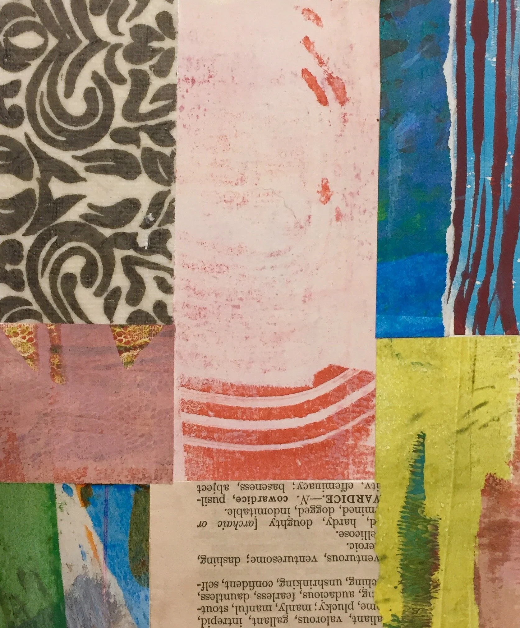


It's March!!! There is something about March that feels more like the beginnings of a new year to me, and I am feeling inspired. Every year I chose two or three words that I feel aligned with. These are usually words that signify an area of intended growth for me. I actually chose four this year, somehow I think this will be a very pivotal year (as if the last few have not been - haha). Creation - That seems fitting doesn't it? I am a creator at heart. I am dedicated to develop my skills and my artistic expression. Creation in all its forms is the pulse in life that brings me to that special place of paying attention. Connection - I can be a bit of a hermit. I like my "Kathryn" time, but know the importance of my growing friendships and relationships in general, so I am making more time for that in my life. I bring creation into my connections by teaching, but also spending quality time with friends making art together. I am also the type of person that actually gets a lot more accomplished when working with another person. Ideas are more free flowing and I can get into that state of flow very easily when sharing my creative time with others. Change - Not that I am trying to reinvent myself, more that I am open to change with out resisting. Change is constant, and I want to be an active participant. I like to see how my art is changing, it is like learning a new language and that can be exhilarating. The collages in this post were just that. Fresh and new for me. Strength - This is about resilience, because sometimes I just feel like I am walking through molasses. I've learned that those days don't last long and there is usually something really poignant on the other side, and I usually have an epiphany if I am patient. It is truly the learning to be patient and being with the molasses that is the lesson for me to embrace. I am beginning to truly understand that is the key to what ever comes my way, to just stay with it. So happy New Year all over again, let's hope there are many silver linings for all of us. Included in this post are images of some very freeing collages that I have done while sitting at the dining table chatting with one of my closest friends. Something near and dear to my heart.

The Kathryn Bevier Collection
The Kathryn Bevier Collection is a set of colors that I created for myself and for Enkaustikos. I developed them as an alternative to the high key single pigment color palette. Variations on a primary palette are present, plus a few extra colors. Deep Lake and Blue Rain are “blues” - Sanguine and Alizarin Gold are “reds” - Bittersweet and Harvest Moon are “yellows”. the additional colors are Hedera, a deep woodsy green, Nostalgia, a muted aqua, and Purple Haze, a light gray with strong purple tendencies. All of these paints are a blend of two or three pigments making them perfect to use as is, or to mix as you see fit. Make sure to use plenty of wax medium to extend the pigment load and get the flow you desire.

The Power of Gray Set
The Power of Gray colors came about as a result of my many years of teaching. Helping people to understand the value of using neutral or muted colors to create compositional direction, resting spots, and to enhance surrounding colors in their art has become a primary focus in my classes. Despite their appearance, you might be very surprised to find out how lively these gray tones are. There is nothing dull about these paints. I developed these colors for myself and for Enkaustikos using a combination of pigments. None of these grayed out hues are made by mixing black and white together, which would have been very easy, but not producing interactive grays. These colors are full of life, just on the quiet side.

I’m not boasting, I’m just proud.
I am proud to say that I have created a tremendous line of paint colors for Enkaustikos. Some of these colors have been for exciting projects, some are custom colors for other artists, some as limited editions, and many to enhance and extend the color palette of the paint line that already exists.
I am proud, and I am grateful for having the opportunity to develop paint formulas. The color in the accompanying image is called Nostalgia. I originally created it for an amazing artist Stephanie Roberts-Camello, but it has quickly become one of my all time faves and love using it. It is an opaque paint, a very soft aqua leaning more towards green. I named it Nostalgia because it reminds me of the green milk glass of the 40’s and 50’s. Plus, I have strong nostalgic tendencies running through my veins.

Blue Rain
We all know the sweet smell of rain
but do you know how it smells from my childhood window?
Six decades encapsulated in that one distinct fragrance
The smell of a blue Carolina sky opening
or the mesa clearing off after the storm with its sharp contrast of orange
The smell that forces itself into the room when I open the windows
the room my mother has made beautiful for my visit.
No
No more than I know what it smells like to you.
Perhaps though, there is a knowing that connects us
in the underground reservoir that passes through our veins
The veins we don’t even know exist
Like drops of captured memories
Tears
They fall hard against the asphalt
And the frogs begin to sing
©Kathryn Bevier 2019